Frontiers
by: Colleen Truskey
It’s been several weeks since my last blog post, and I’ve been busy in that time. The Salem Maritime Festival was this past weekend, and just yesterday the Draken Harald Hårfagre (the world’s largest operating Viking ship) docked at Central Wharf. Allison Anholt and Jessica Plance from ACE stopped by last week on their tour of the region, as did Paloma Bolasney from NPS. A couple of times now I’ve helped Emily Murphy, Salem Maritime’s curator, with inventory (which involved crawling beneath eighteenth century bedroom furniture). I’ve also visited the Salem Farmers’ Market a number of times with my officemate and fellow CRDIP intern, Jess Analoro, and continue to explore the region on my weekends off. Too much to see, and not enough time to see it!
I’ve been just as busy at the office. Cody O’Dale (my partner in this work) and I have spoken with more people than I can count about our project. There have been plenty of conversations with folks throughout NPS (and throughout the country), of course, but we’ve also talked to folks from Fish & Wildlife, Bureau of Indian Affairs, and the Bureau of Ocean Energy Management, in addition to continued conversations with the Forest Service and the Department of Housing and Urban Development. The conversations have covered everything from technical GIS applications, to the legal requirements of Section 106 and NAGPRA, to the practical needs and experiences of those who might potentially use this application. There are a number of stakeholders invested in this project, which is important to remember as Cody and I draft out our final design for the application. In addition to the technical and political challenges, however, it’s also important that we deal with the challenges presented by the medium in which we’re working — maps.
Maps are man-made, and like any man-made object they are subject to a number of distinctly human faults and limitations. A map is an interpretation of the world as we experience it–an approximation of the environment we encounter on a daily basis. Every map highlights that which its creator felt was important and omits that which was considered irrelevant. In other words, we can often learn more about ourselves from maps that we can learn about its subject places. There is no such thing as an “unbiased” map.
(Most folks are familiar with this issue as it’s framed within the debate over the use of the Mercator projection, succinctly described in this clip from “The West Wing.” You can also explore how common maps misrepresent the relative size of countries using “The True Size Of…” website.)
A map of the North American continent with country and state boundaries depicts a very particular socio-political understanding of that landscape, for example. However, we could divide the continent in any number of ways–perhaps by watershed, or by biome, or by major linguistic divisions, or by relative economic circumstances. Each of these maps would tell us something different, but there is no map that could capture all of these elements (along with others) in their entirety effectively.

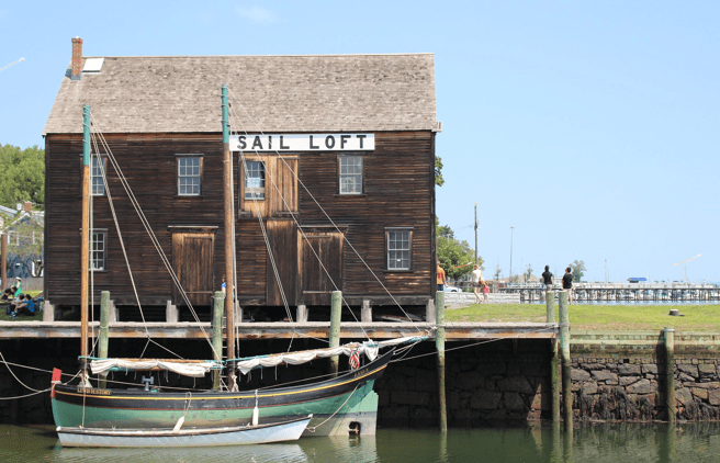
The Sail Loft on Derby Wharf during the Salem Maritime Festival and the arrival of the Draken Harald Hårfagre to Central Wharf. Both events were great opportunities to explore maritime history and culture.
When it comes to indigenous peoples and maps, the conversation is only further complicated. Think of the most popular understanding of the “frontier” — a place unknown, undeveloped, and uninhabited, at least by “civilized” men. The frontier is home to uncharted wilderness, and, at least in the American imagination, the unmapped frontier is also home to “Indians.” When the frontier is replaced by territories and states, when those nascent borderlines are drawn on maps for the first time, the landscape is irrevocably transformed. The map would have you believe the land is now settled, comfortably nestled in the idealized experience of the United States of America. There is no room for sovereign indigenous nations on such a map.
In this context, the project Cody and I have been assigned represents a unique way of “rethinking” how maps are used to speak with and about indigenous peoples. By highlighting tribal areas of interest–lands that are meaningful to a community based on their historical and contemporary experiences of those places–we are, in essence, reimagining the American landscape as a “tribal” landscape.

The Public Garden in Boston. If you were to map a city like this one, what would you include? What would you exclude? How might your interpretation of the city change based on what you chose to illustrate on the map?
Of course, the final application won’t be perfect. It can’t be perfect. The conversation surrounding how land is experienced, valued, and claimed is ongoing. Our data is both incomplete and dynamic, and is presently bound to databases in a variety of formats and a number of locations. A number of technical, theoretical, and experiential challenges remain to be tackled. How and where will data be stored? What will be considered “accurate” data? How will the application be updated? How can we avoid the potential misuse or misapplication of this product? How can we best meet multiple disparate needs, ranging from the needs of tribal communities to park superintendents?

Our first go at a map that displays tribal areas of interest by county, based on data from the Department of Housing and Urban Development. This map represents several hundred layered interest areas, and will be used as the basis of our final application.
These are questions Cody and I’ll continue to tackle as the weeks wind down. There’s a lot to be done, but I’m confident we’ll produce a valuable application. ‘Til next post!